How should you use heatmaps for your analysis?
- Andrew Kim

- Mar 29, 2020
- 8 min read
Updated: Apr 3, 2020
A basic analysis on how important using heat maps are for your sabermetric analysis.

Often, when one does data analysis on a player, they have to rely on multiple statistics and trends on a graph in order to be able to recognize a player’s improvements as well as their weaknesses. One tool that is often given to us and utilized frequently when analyzing a player and his performance are heat maps. They offer a player’s strength and performance based on the location of pitches in the strike zone and give us a comprehensive point of view on any glaring weaknesses that a player might have. Heat maps are often found in many of the big baseball websites such as Fangraphs and baseball savant, but they are often jumbled with a bunch of numbers and with different statistics for each heat map, it can be confusing for the user to know how to use the heat map effectively.
But how can we utilize a heat map effectively so that we can see a player’s weakness or change? How can we use heat maps in order to see a change in a player’s abilities over time?
Today, we are going to go over some of the heat maps from Baseball Savant and Fangraphs, and apply them to players today so that we can get a better sense of why these players excel at what they do compare to their peers at the MLB.
Heatmaps from Fangraphs
First, when analyzing these players through the heat maps, it is often important to look at the tools given to us in order to modify the heat maps to our favor.
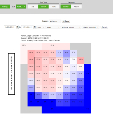
When you open up the Fangraphs page on heat maps, it should look like the image on the left. As noted, this heat map is for a hitter (we will analyze pitchers a little bit later), so we want to look for areas where our hitter (in this case Aaron Judge) has particularly weak and strong spots in his hitting.
Looking at the top bar to the picture above, we can see Grid Type and the Viewpoint for the strike zone. For all of our intents and purposes, we will mainly stick with the default settings, but I would highly recommend changing the viewpoint of the heat map from Catcher to Pitcher if that is preferable to you.

The most important aspect of this heat map, however, is the Little Stat drop-down menu in the top bar, which will guide your analysis and give you new insights into the hitter. With the Little Stat drop-down menu, we can choose multiple stats and see how the hitter has changed: not only through the hitter approach to certain pitches but also how pitchers have adjusted to the hitter. Although we can use only one statistic at a time, some statistics are more useful than others depending on the question being asked, so be careful when asking
statistics.
Some of the more useful ones include (generally) :
● Contact% (for any weak spots in terms of where the pitches are located)
● ISO/P (Metric of Power in terms of pitch location)
● Swing% (Where they often swing the most)
● cStrike% (Use this mainly for framing issues )
● Pitch% (Where most pitchers throw the ball toward)
● GB/P (Most likely these regions are going to be where the player doesn’t make as ideal contact as they wanted to)
The dependence of these statistics depend on the analysis done the player, so I can’t say definitively that the statistics mentioned above will serve the purpose of the analysis that you are doing, but it is important to take note of the importance of each statistic and ask what question does analyzing the statistic help with your question.
Another important aspect to look at while in the Fangraphs page are the drop-down menus for the certain counts or certain pitches that each player faces. Although numerous, knowing which counts or pitches you want to analyze will help you give a clear idea on the player’s weakness and strength in terms of any glaring weak spots in the player’s play style. If you just want to measure a player's general skill level and where his “sweet” spot is, it is fine to use all counts and all pitches to find it. However, if you want to be more in-depth into the performance of the player, it might be more practical to change the pitches that are thrown to the player to change the count.
For example, let’s take a look at Aaron Judge’s heat maps with fastballs as opposed to offspeed pitches such as sliders.

The image above us is the heat map of contact% for his fastballs. As we can see, he excels at hitting the fastball inside the plate, both up and down in the strike zone. His dominance with the fastball also continues toward the middle of the strike zone, but out of all the strike zones, Aaron Judge struggles with a fastball high or low and away. A possible explanation to his dominance with inside pitches comes from the pitcher’s instinct to “jam” Aaron Judge since he is such a huge player with a huge strike zone and large arms that are hard to hit the inside of the plate. Since Aaron Judge has seen many fastballs inside of the zone, he times his swing early so that he can still make solid contact with the baseball.
But this heat map might be misleading as it only shows his contact% with fastballs. With the regions that he hits exceptionally well, it might be better to look at other heat maps to show where pitchers mainly locate their pitchers as so we don’t err on the small sample size of a player.
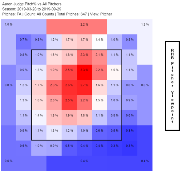
Here is a heat map of pitches% of fastballs to Aaron Judge in 2019.

As we can see with the heat map toward us, most of his fastballs aren’t even towards the inside of the plate. Instead, they are more located towards the center of the plate and upwards toward the plate. Our previous explanation that Aaron Judge might be seeing many inside pitches might have been incorrect. Instead, we might have to constitute that we don’t have enough information on Aaron Judge’s performance in terms of towards the inside of the plate in order to make a feasible conclusion of him.
What we can make a logical conclusion of Aaron Judge is his dominance of fastballs towards the middle of the plate and upwards. Pitchers should generally avoid pitching towards those areas as Aaron Judge’s chances of whiffing on these fastballs are slim compared to getting him to strike out on an offspeed pitch. The dominance of fastballs up in the zone can be attributed to the 2017 season, in which Aaron Judge suffered a major slump as a result of that high fastball, but was able to triumph over that obstacle towards the end of the season.
Which now brings us to Aaron Judge’s heat maps with his slider.
Here is his contact% of sliders in the 2019 season.

As we see, his dominance of inside sliders is most prevalent in the heat map above but mentioned previously, we need to look at other heat maps in order to get a more full picture of his approach and performance against sliders.
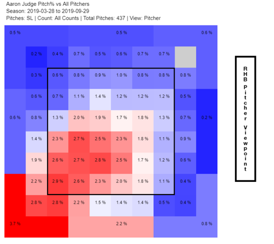
Here is a pitch% heat map of Aaron Judge in 2019.

Whoa! There was a huge difference in between the contact% and his pitch% of sliders, indicating that Aaron Judge struggles even hitting sliders if they are thrown outside. Noting this type of weakness is crucial for pitchers to get these players out, as throwing balls where the pitcher is most comfortable might be in the sweet zone for hitters such as Aaron Judge. However, although he might not be making contact with sliders away from the strike zone, he still might be able to recognize them as unhittable pitches and not swing on them.

As we can see, although he does see a lot of sliders away from him, he does not seem to always get a strike outside and low, meaning that he most likely does not swing at those pitches. However, despite the previous statement, there is still significant improvement for Aaron Judge’s approach with sliders as he still gets around 40%-50% of the sliders low and away from him getting called strike. If he can find a way to decrease the percentage (fouling off the pitch) to 30%, we would see a significant increase in Aaron Judge’s ability to hit the ball. One interesting thing to note about Aaron Judge is his ability to hit sliders that are close and up, a common location for pitchers to throw in order to “jam” the hitter especially for big hitters such as Aaron Judge. Looking back at videos of Aaron Judge, his ability to hit well inside the strike zone has to do with the fact that he maintains his batting stance form when pitches are thrown in the middle or outside, meaning that he can maximize his power output while still giving solid contact with the barrel of the baseball.. However, when pitches start to go outside of the strike zone, he begins to lose his form and stretches his body in order to reach the ball, meaning that he not only loses his bat speed, but also a chance of fouling off the pitch.
Knowing which of the heat maps to put together is crucial in order to recognize the trends and strength of a hitter, and it will definitely give you an advantage when analyzing baseball players.
Heat maps from MLB Savant
Although not as flexible as the heat maps from Fangraphs, the heat maps from MLB Savant are still invaluable as they can offer you easily read heat maps with some of the statistics that aren’t available in the Fangraphs heat maps.
When you first open the heat maps from MLB Savant, the web page should look something like the image below.

As seen with the drop down menus offered, you can only change the year and the pitcher throws (LHP or RHP), meaning that if you wanted to do an analysis of a player by every month, you would have to rely on the heat maps offered on Fangraphs. However, if you wanted to do a general analysis on a player, using these heat maps aren’t that bad since they would give you a general overview of the player. Looking at the plate at the bottom of each heat map, the heat map is in the catcher’s view, meaning that if you want to use Fangraph heat maps along with the savant heat maps, you would have to make sure that both are in catcher’s view.
I won’t be going over how to use the heat maps since I just did in the previous section with the heat maps from Fangraphs, but I will note some of the different statistics that they measure and some recommendations for which heat maps are the more valuable ones.
First, the biggest advantage to using the heat maps from the baseball savant website is the fact that they include the statcast data, which includes exit velocity, barrels/PA%, Hard Hits, xOBP, xwOBA, and xBA. All of the statistics mentioned above are extremely useful in research as they can be used to measure a player’s ability not only to hit the ball, but how well they hit the ball, giving us a better insight into the weakness and strength of each hitter.
In general,
● Use Barrels/PA%, Exit Velocity, and Launch Angle to measure the power of the players. A high Barrels/PA% and Launch Angle (although not too high) makes a strong power hitter as opposed to one with a low launch angle
● Use xwOBA and xOBP to get a general sense of the player’s ability about their strong points or weaknesses. These statistics take into account the walks and discipline of the player, so using these two as a general heat map is not that bad compared to other heat maps.
Second, with the easy interface and headers for each of the heat maps, it makes it easy for people like me to find some heat maps quickly and get the analysis for that player as soon as possible. Although some of these heat maps are too simplified for detailed analysis, using one or two in a general player profile is not detrimental to the player at all and can be even useful.
Conclusion
Heat maps are a great tool to use if you are doing a player analysis, trying to note the minute details that make the player exceed well or something that could lead to their downfall. The important thing when using heat maps is that they aren’t the end all be all statistics or data analysis that sabermetricians use. They should only be used to support the data or claim that you are making or find useful statistics that reading a stat line won’t let you do. By combining and using multiple heat maps together, you can add a very powerful arsenal of data tools to use to help analyze players.
Created and Published 04/03/20.

Comments